News: TechTarget and Informa Tech’s Digital Businesses to Combine. Learn More
The context of modern tech business
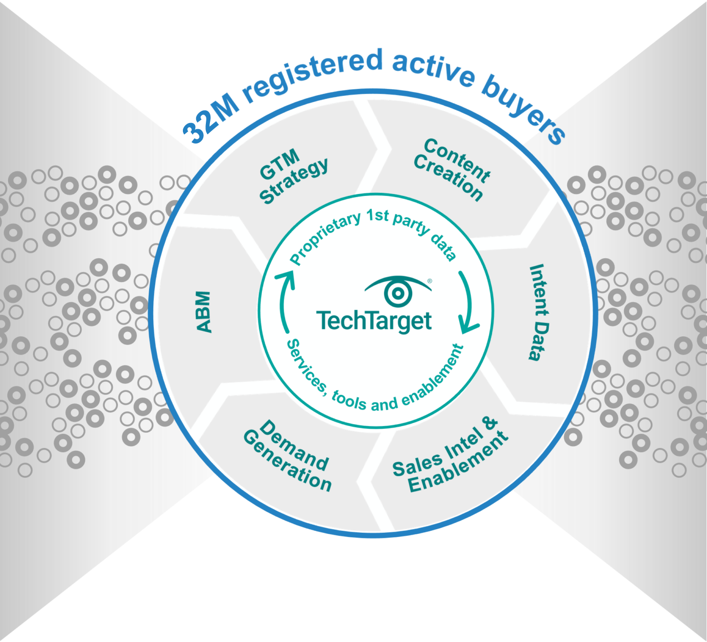
Maximum GTM performance requires doing all the right things, in exactly the right context. If you aren’t where the buyers are buying, you’re inefficient. On TechTarget’s network of 150+ websites and 1,100+ content channels, we create the modern digital buying context. That’s why more of your buyers are doing purchase research here than anywhere else. Then we provide the perfect combination of capabilities to intercept many more of them, much faster.

Closer to your ICPs
You can’t do more business without engaging more of the right people. Because of our content publishing model, even when the buyers you want aren’t on your website, they are active on ours. With 30M+ opt-in tech professionals, your critical targets are researching with us right now. And since they’re already engaging with us in a buying context, it’s why we can make so many of your GTM jobs much, much easier.

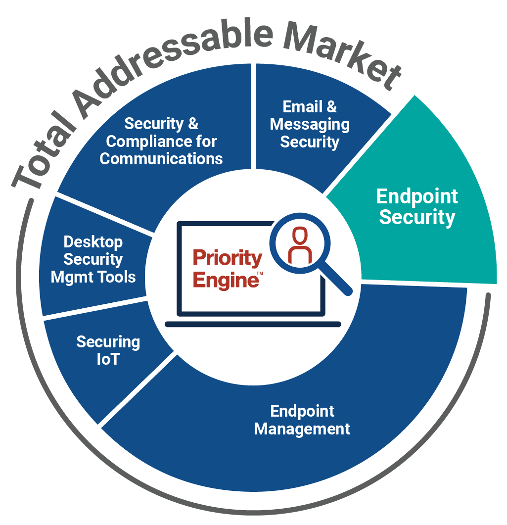
How TechTarget’s audiences align with your market
Example: Endpoint Security
9,600+ accounts active
164,100+ activities taken
5,950+ leads delivered
Connected to real buyers
A cold contact supplier can only tell you who might be the right people, leaving you to pound away at low-quality, high-volume outreach. That’s what the intent data revolution is all about. Active prospects are doing purchase research with us right now, using the proprietary content we build. So we can tell you precisely who you should prioritize and what to say. We share more real buying team members, in the context of more real purchases, directly with you.
technology websites
#1
in Google for B2B tech
full-time editors and contributors
indexed Google pages
industry analysts
monthly visits
Search for active demand in your category
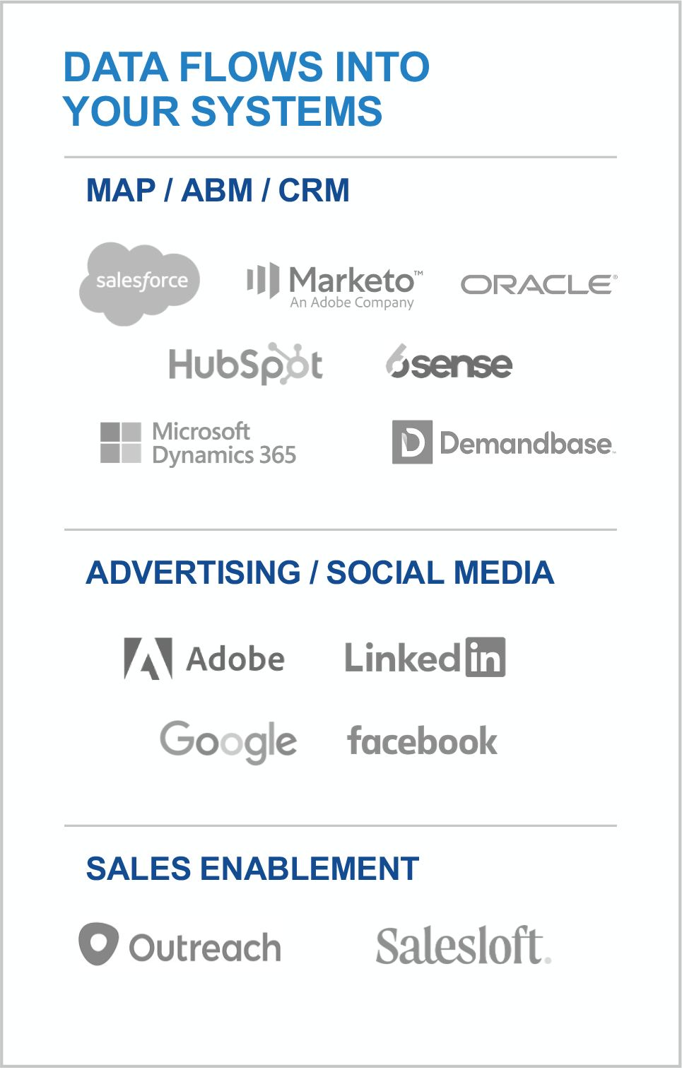
30M+ opt-in tech prospects and growing. Priority Engine™ gives you direct access to the most active buyers in your space.
Scalable at speed
You want better yields from your plans. We’ll help you magnify them for maximum impact. From hyper-granular awareness-building advertising solutions to precision intent data and specialized lead types, we energize any campaign or target account list, for sales and marketing alike. Armed with the best data in the world, our platforms and full-range services can turbo-charge your programs to win.
Learn more
Aligned for better business
To maximize GTM potential, you need three core elements working perfectly together:
- You’ve got to perfectly position for your ICPs.
- You have to optimize execution across multiple channels.
- And you’ve got to stay pipeline-productive even as you scale.
Since weakness in one GTM area can undermine the whole, we’ve built TechTarget to help you strengthen each critical function. We help your teams deliver better for each other, and better for the business, end-to-end.
Learn more
Built to give you leverage
TechTarget’s offerings meet every client where they are, from start-ups to the world’s most sophisticated players. That’s why more than 3,000 of the best companies in every tech category look to us for the best ways to build on what they’ve already got. We can integrate our platforms into your stack, or you can use them as standalones. We can build programs for you from scratch or help make what you’ve built out-perform past ROIs.
learn more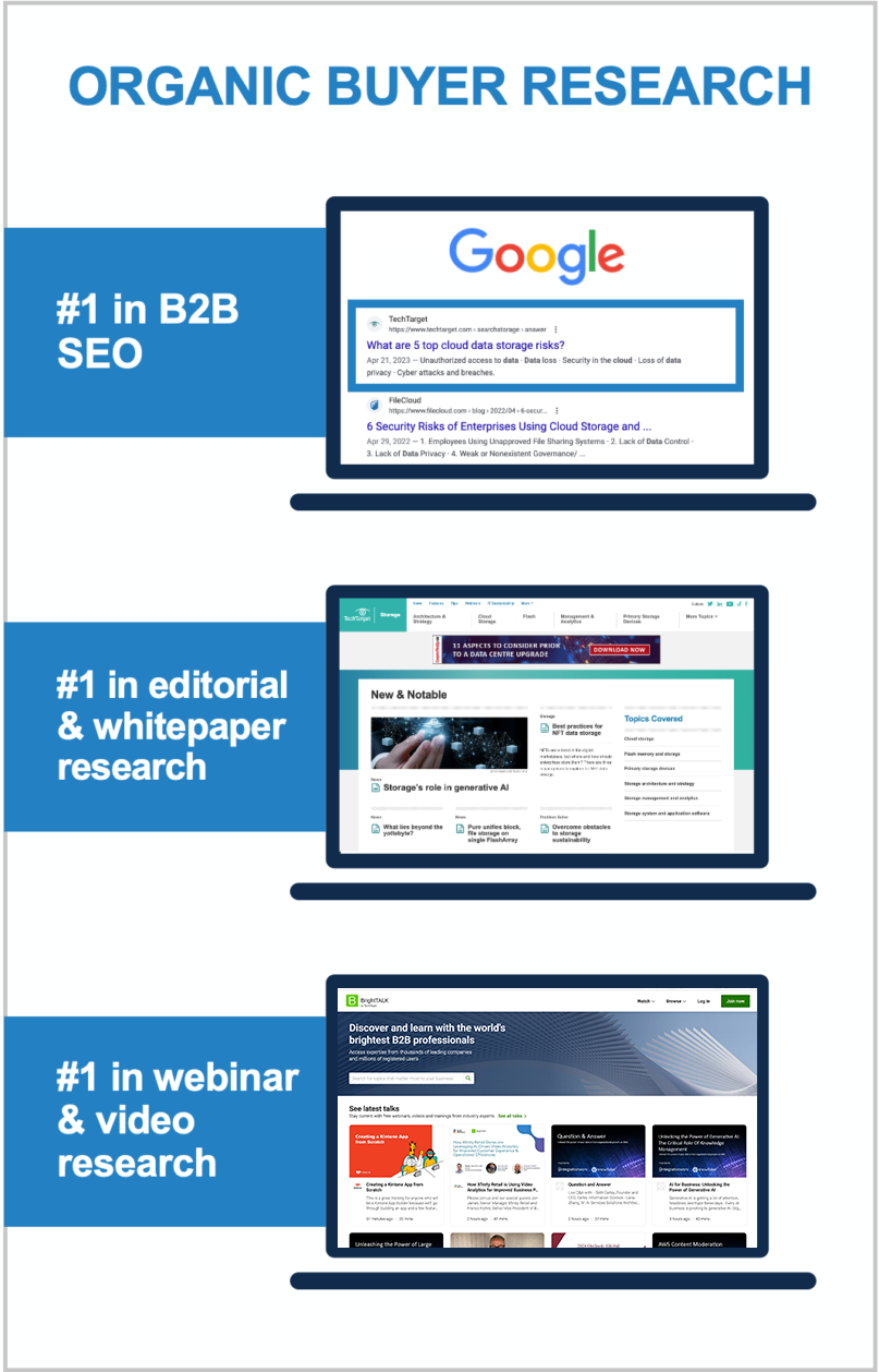
World’s largest proprietary network
Too many tech marketing teams waste time and ad dollars scouring the web for disconnected crumbs. The internet doesn’t actually function that way! Buyers go to the sites they already use, or they search for the information that reputable outlets are known to supply. That’s why TechTarget’s content usually shows up right on the first page of any Google search for enterprise tech. It’s why we’ve structured our network to cover the solution topics that matter most. So don’t get stuck fumbling around in some AI-scraped dark funnel, because we’re constantly shining a light on more business for you right now.
Explore the TechTarget Network
-
BrightTALK by TechTarget: Big Data and Data Management Community
-
BrightTALK by TechTarget: Business Intelligence and Analytics Community
-
Enterprise Strategy Group by TechTarget: Data Analytics and AI
-
Enterprise Strategy Group by TechTarget: Data Management
-
TechTarget Business Analytics
-
TechTarget ComputerWeekly.com
-
TechTarget ComputerWeekly.com.br
-
TechTarget ComputerWeekly.de
-
TechTarget ComputerWeekly.es
-
TechTarget Database China
-
TechTarget Data Management
-
TechTarget Data Science Central
-
TechTarget Enterprise AI
-
TechTarget Information System Japan
-
TechTarget IoT Agenda
-
TechTarget LeMagIT
-
TechTarget Search Oracle
-
TechTarget Search SAP
-
TechTarget SMB Japan
TechTarget BI China
-
BrightTALK by TechTarget: Application Development Community
-
BrightTALK by TechTarget: Application Management Community
-
Enterprise Strategy Group by TechTarget: Application Modernization
-
TechTarget App Architecture
-
TechTarget ComputerWeekly.com
-
TechTarget ComputerWeekly.com.br
-
TechTarget ComputerWeekly.de
-
TechTarget ComputerWeekly.es
-
TechTarget Develop Japan
-
TechTarget LeMagIT
-
TechTarget Software Quality
-
TechTarget TheServerSide
-
BrightTALK by TechTarget: Business Management Community
-
BrightTALK by TechTarget: Enterprise Applications Community
-
BrightTALK by TechTarget: Finance Community
-
BrightTALK by TechTarget: HR Community
-
BrightTALK by TechTarget: Legal Community
-
BrightTALK by TechTarget: Marketing Community
-
BrightTALK by TechTarget: Sales Community
-
TechTarget ComputerWeekly.com
-
TechTarget ComputerWeekly.com.br
-
TechTarget ComputerWeekly.de
-
TechTarget ComputerWeekly.es
-
TechTarget Content Management
-
TechTarget Customer Experience
-
TechTarget Customer Experience Japan
-
TechTarget Database China
-
TechTarget ERP
-
TechTarget ERP Japan
-
TechTarget HR Software
-
TechTarget LeMagIT
-
TechTarget Search Oracle
-
TechTarget Search SAP
-
TechTarget SMB Japan
-
BrightTALK by TechTarget: Cloud Computing Community
-
BrightTALK by TechTarget: Help Desk and Support Community
-
BrightTALK by TechTarget: IT Project Management Community
-
Enterprise Strategy Group by TechTarget: Infrastructure
-
Enterprise Strategy Group by TechTarget: Operations
-
TechTarget Cloud Computing
-
TechTarget Cloud Computing China
-
TechTarget Cloud Japan
-
TechTarget ComputerWeekly.com
-
TechTarget ComputerWeekly.com.br
-
TechTarget ComputerWeekly.de
-
TechTarget ComputerWeekly.es
-
TechTarget IT Operations
-
TechTarget LeMagIT
-
TechTarget Search AWS
-
TechTarget Systems Develop Japan
-
TechTarget Systems Operation Management Japan
-
BrightTALK by TechTarget: Customer Experience Community
-
Enterprise Strategy Group by TechTarget: Customer Experience
-
TechTarget ComputerWeekly.com
-
TechTarget ComputerWeekly.com.br
-
TechTarget ComputerWeekly.de
-
TechTarget ComputerWeekly.es
-
TechTarget LeMagIT
-
TechTarget Customer Experience
-
TechTarget Customer Experience Japan
-
BrightTALK by TechTarget: Data Center Management Community
-
BrightTALK by TechTarget: Virtualization Community
-
Enterprise Strategy Group by TechTarget
-
TechTarget ComputerWeekly.com
-
TechTarget ComputerWeekly.com.br
-
TechTarget ComputerWeekly.de
-
TechTarget ComputerWeekly.es
-
TechTarget Data Analysis Japan
-
TechTarget Data Center
-
TechTarget Data Center China
-
Search Data Center Italy
-
TechTarget LeMagIT
-
TechTarget Search VMware
-
TechTarget Search Windows Server
-
TechTarget Servers and Storage Japan
-
TechTarget SMB Japan
-
TechTarget Sustainability and ESG
-
TechTarget Virtual China
-
TechTarget Virtualization Japan
-
BrightTALK by TechTarget: End User Computing Community
-
BrightTALK by TechTarget: Mobile Computing Community
-
Enterprise Strategy Group by TechTarget: End User Computing
-
TechTarget ComputerWeekly.com
-
TechTarget ComputerWeekly.com.br
-
TechTarget ComputerWeekly.de
-
TechTarget ComputerWeekly.es
-
TechTarget Enterprise Desktop
-
TechTarget LeMagIT
-
TechTarget Mobile Computing
-
TechTarget Smart Mobile Japan
-
TechTarget Virtual China
-
TechTarget Virtual Desktop
-
BrightTALK by TechTarget: Business Continuity/Disaster Recovery Community
-
BrightTALK by TechTarget: Storage Community
-
Enterprise Strategy Group by TechTarget: Data Protection
-
TechTarget ComputerWeekly.com
-
TechTarget ComputerWeekly.com.br
-
TechTarget ComputerWeekly.de
-
TechTarget ComputerWeekly.es
-
TechTarget Data Backup
-
TechTarget Disaster Recovery
-
TechTarget LeMagIT
-
TechTarget Servers and Storage Japan
-
TechTarget SMB Japan
-
TechTarget Storage
-
TechTarget Storage China
-
TechTarget Virtual China
-
TechTarget Virtualization Japan
-
BrightTALK by TechTarget: Health IT Community
-
TechTarget EHRIntelligence
-
TechTarget HealthCareExecIntelligence
-
TechTarget Health IT
-
TechTarget HealthITAnalytics
-
TechTarget HealthITSecurity
-
TechTarget HealthPayerIntelligence
-
TechTarget HITInfrastructure
-
TechTarget LifeSciencesIntelligence
-
TechTarget Medical IT Japan
-
TechTarget mHealthIntelligence
-
TechTarget PatientEngagementHIT
-
TechTarget PharmaNewsIntelligence
-
TechTarget RevCycleIntelligence
-
TechTarget Xtelligent Healthcare Media
-
BrightTALK by TechTarget: IT Security Community
-
Enterprise Strategy Group by TechTarget: Cybersecurity
-
TechTarget ComputerWeekly.com
-
TechTarget ComputerWeekly.com.br
-
TechTarget ComputerWeekly.de
-
TechTarget ComputerWeekly.es
-
TechTarget IoT Agenda
-
TechTarget LeMagIT
-
TechTarget Security
-
TechTarget Security China
-
Search Security Italy
-
TechTarget Security Japan
-
TechTarget SMB Japan
-
BrightTALK by TechTarget: Network Infrastructure Community
-
Enterprise Strategy Group by TechTarget: Networking
-
TechTarget ComputerWeekly.com
-
TechTarget ComputerWeekly.com.br
-
TechTarget ComputerWeekly.de
-
TechTarget ComputerWeekly.es
-
TechTarget IoT Agenda
-
TechTarget LeMagIT
-
TechTarget Networking
-
TechTarget Networking China
-
TechTarget Network Japan
-
TechTarget SMB Japan
-
BrightTALK by TechTarget: Collaboration and UC Community
-
Enterprise Strategy Group by TechTarget: UC and Collaboration
-
TechTarget ComputerWeekly.com
-
TechTarget ComputerWeekly.com.br
-
TechTarget ComputerWeekly.de
-
TechTarget ComputerWeekly.es
-
TechTarget LeMagIT
-
TechTarget Unified Communications
-
TechTarget Unified Communications Japan
3,000 clients already crushing it
We build our buyer audiences for companies like yours. We see where markets are going because our publishing business depends on it. If your space is new, we educate the audience. If you’re defending a legacy position, we support your specific situation.
View Case Studies


